Since I have both design and illustration skills, poster projects are a particular favorite of mine. For instance, I was the designer to officially initiate the concept of doing a poster every year for the Lilac Festival. I know, big deal, right?
I was honored to receive the commission for this year’s Park Avenue Festival Poster.
I always find it a bit tenuous when first engaging in such a project.
Grasping the type of concept the committee or board is expecting
is always an interesting process.
By simply asking for the strategy or brand description of what the festival really stands for, and WHO the perceived target audience is, wasn’t getting anywhere.
The other option for us designers is to simply launch into design concepts and rely on the group to discover the direction through the creative. I know, a little scary… and the long way to go.
I could go through a rationale for each of the different layouts shown here. Let’s just say I went from a people-watching theme, to an approach that includes all the tributary roads connected to the Park, to an approach suggesting the Park is the fashion center of Rochester. No luck. My layouts were sent out as PDFs, then send back rejected. It was tough being so removed from the process.
After thinking of a more traditional approach, two café scenes were developed.
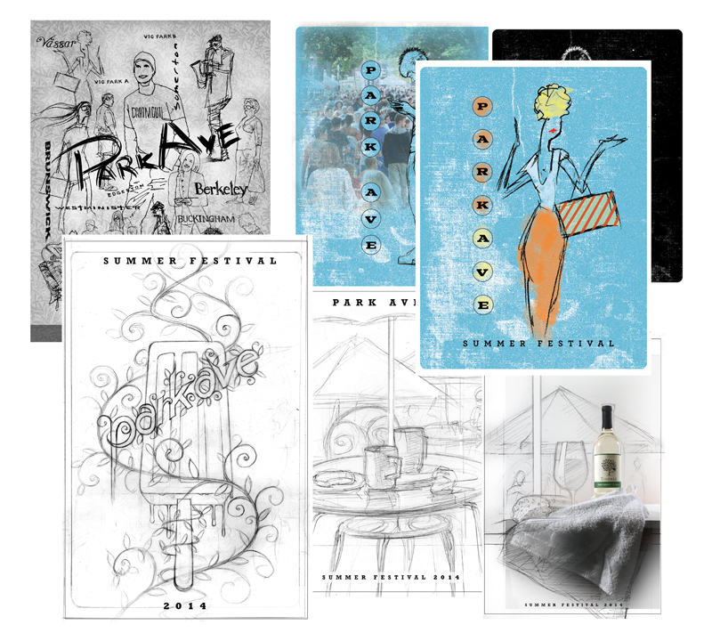
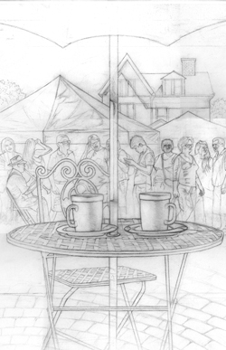
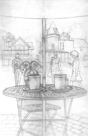
Once the specific layout was approved, several pencils were developed
to get the right mix of picture elements desired.
It is refreshing to begin to paint after all of that.
It is like starting fresh on the project.
The painting really helps me create a mood and almost tell a story.
The challenge was to incorporate all the asks by the committee and come up with a cohesive piece.
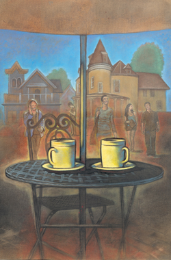
The result is a traditional approach, but handled like an illustrated cover of a novel.
The coffee cups are on the table, but who left them?
They seem to radiate a mystery.
Who are the people in the background?
What Victorian drama at dusk are they involved in?

Come to festival and find out!